Copper metallic ink with purple pastel chalk
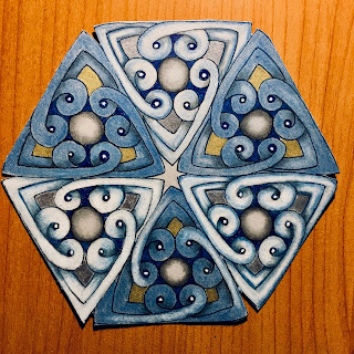
Gold metallic ink with blue and white pastel chalk
Gold metallic ink with blue and white pastel chalk
Notice the two blue inks. One is a blue back PN (plastic nib) pen and the other
is a blue Micron. These are gorgeous on gray.
Gold metallic ink with brown Micron on tan paper
Gold metallic ink with blue watercolor on gray
Gold metallic ink with blue and white pastel chalk
Purple PN with white and violet chalk on gray
Somewhat surprised at how I like the gray paper, I still have some exploring to do. I was pleased with the purple ink, as well as the copper. I'm having some trouble blending the pastel chalks on the card stock. It's probably easier on the gray tiles from Zentangle, which look like they have a soft, fibrous feel that really takes well to the chalk.
Have you tried the new paper? What do you think?


